conversion to app launch after restructuring the landing page based on heatmap data
Back to selected projects
Defihelper
Fintech / Crypto
DeFi portfolio tracking and investment automation.
I worked on interface design, interactive prototypes, A/B testing, and user research to make complex product logic clearer and easier to adopt.
returning users for a new feature after user interviews and onboarding redesign
Overview
A product designed to make high-complexity finance feel more understandable.
Defihelper was built to help users manage DeFi portfolios and automate investment actions that usually require high involvement, constant monitoring, and advanced trading knowledge.
Product
A DeFi portfolio tracking and automation product for users who needed more control, visibility, and decision support.
Main task
Make advanced strategy creation and automation feel accessible to a broader range of users, not only experienced traders.
User mission
Help people manage portfolios, evaluate opportunities, react to important events, and act with more confidence inside a difficult domain.
Product success
Better clarity, stronger adoption of advanced functionality, and measurable improvement in the path from discovery to meaningful action.
Why this problem mattered
Advanced trading products often fail before users experience value.
Product problem
Advanced trading and automation tools are often too complex for everyday users. Creating and managing strategies requires time, confidence, and constant attention, which limits adoption and creates friction early in the experience.
User problem
Managing a DeFi portfolio can easily turn into a second job. Users need to rebalance assets, compare pools, monitor gas fees, follow project updates, and make high-risk decisions without enough clarity or support.
Where it breaks
- Too many moving parts to keep in mind at once
- High cognitive load before users see clear value
- Advanced functionality feels risky too early
- Weak entry points reduce trust and adoption
Before users could benefit from automation, they first had to survive the cognitive load of understanding it.
Discovery and framing
The goal was to locate where complexity turned into drop-off, mistrust, or non-adoption.
The core question was simple: where does the product stop feeling useful and start feeling mentally expensive?
Heatmap data and behavioral signals helped identify where the landing page was losing attention and clarity.
User interviews helped explain why a new feature felt unconvincing and why people were not returning to it.
Alternative onboarding directions and prototypes were used to test clearer entry points into advanced functionality.
Mapped where complexity created friction
I focused on understanding where the product was hard to read, where value was unclear, and where users were dropping out before reaching meaningful actions.
Used heatmap data to rethink landing structure
Heatmap insights helped reveal where attention was getting lost and where the landing page was failing to support comprehension and conversion.
Interviewed users around weak feature adoption
I looked beyond the interface itself to understand why a new feature was not getting traction and what part of the entry experience felt unclear or unconvincing.
Explored multiple onboarding directions
I tested different ways to frame advanced functionality so the first experience felt more understandable, trustworthy, and easier to enter.
Heatmap data showed where attention was getting lost before users reached the intended next step.
User conversations exposed hesitation around a new feature and helped explain weak adoption.
Users were not rejecting the feature itself. They were rejecting uncertainty before action.
The issue was not only functionality, but how advanced value was framed, explained, and entered.
Reasoning path
Value feels abstract
Risk feels too early
Action gets postponed
Product logic flow
Discover
see portfolio state and market context
Evaluate
understand options, risks, and timing
Act
enter automation or strategy with more trust
Monitor
keep visibility without turning it into a second job
Clarity had to appear before commitment. Otherwise the feature felt risky before it felt useful.
Key decisions
The work was less about adding features and more about framing complexity in a way users could trust.
Restructured the landing page around clarity and value perception
The landing page needed to communicate the product’s value faster and make the next step more obvious. Using heatmap data, I reworked the structure to better support comprehension and conversion.
Used research to identify why a new feature was not gaining traction
The issue was not only in the feature itself, but in how it was introduced and understood. User interviews helped uncover why people were not engaging with it and what needed to change.
Designed alternative onboarding flows to improve adoption
In complex products, adoption often depends on the first experience. I created and tested onboarding directions that made advanced functionality easier to enter and easier to trust.
Final direction
The final design direction focused on making complex actions feel legible before they felt powerful.
The final design work focused on making the product feel more understandable at key moments: when discovering its value, when entering advanced functionality, and when navigating decision-heavy scenarios inside the product.
The goal was not to simplify the domain itself, but to make its logic clearer before users had to act inside it.
Decision support at the moment of entry
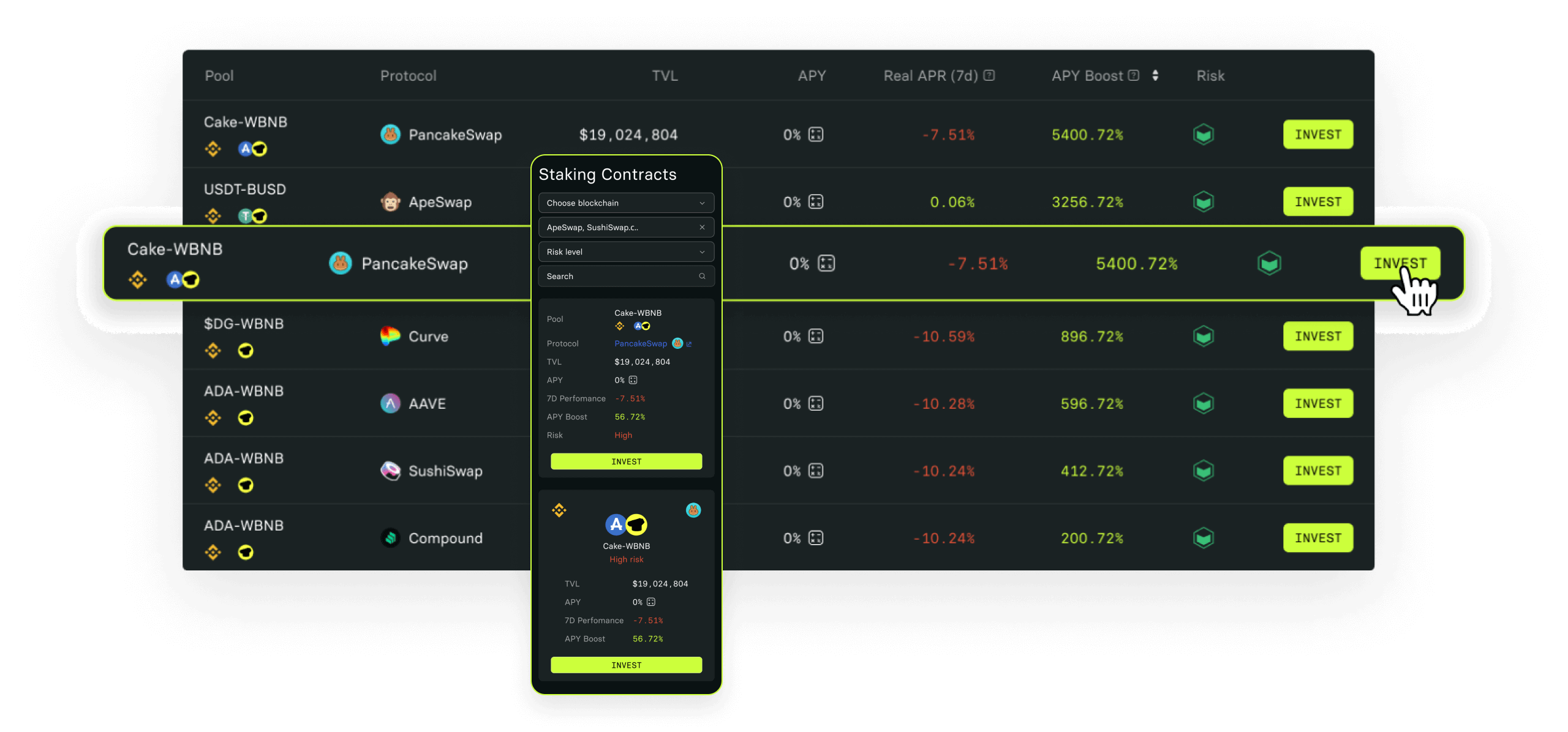
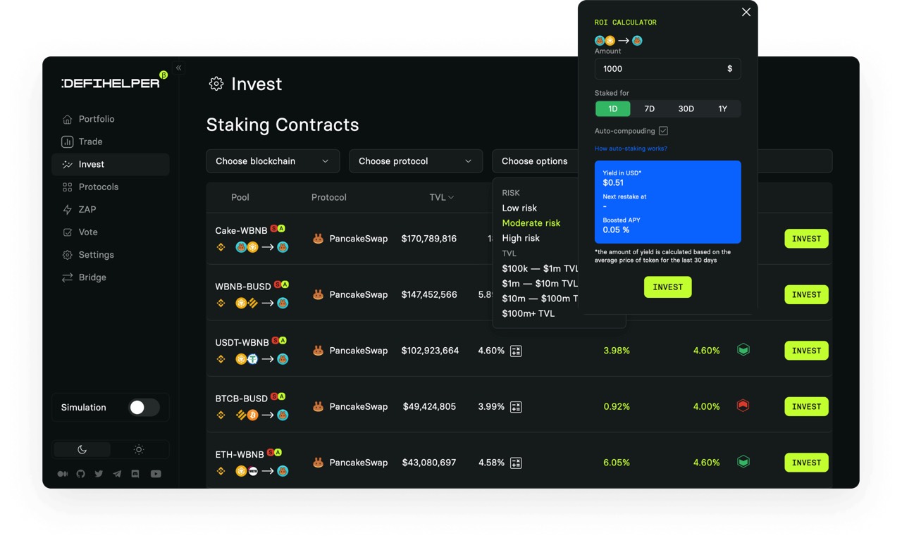
This screen shows how complex pool data, protocol context, and entry actions were brought closer together, so advanced functionality felt more understandable before investment.
Portfolio overview and system readability
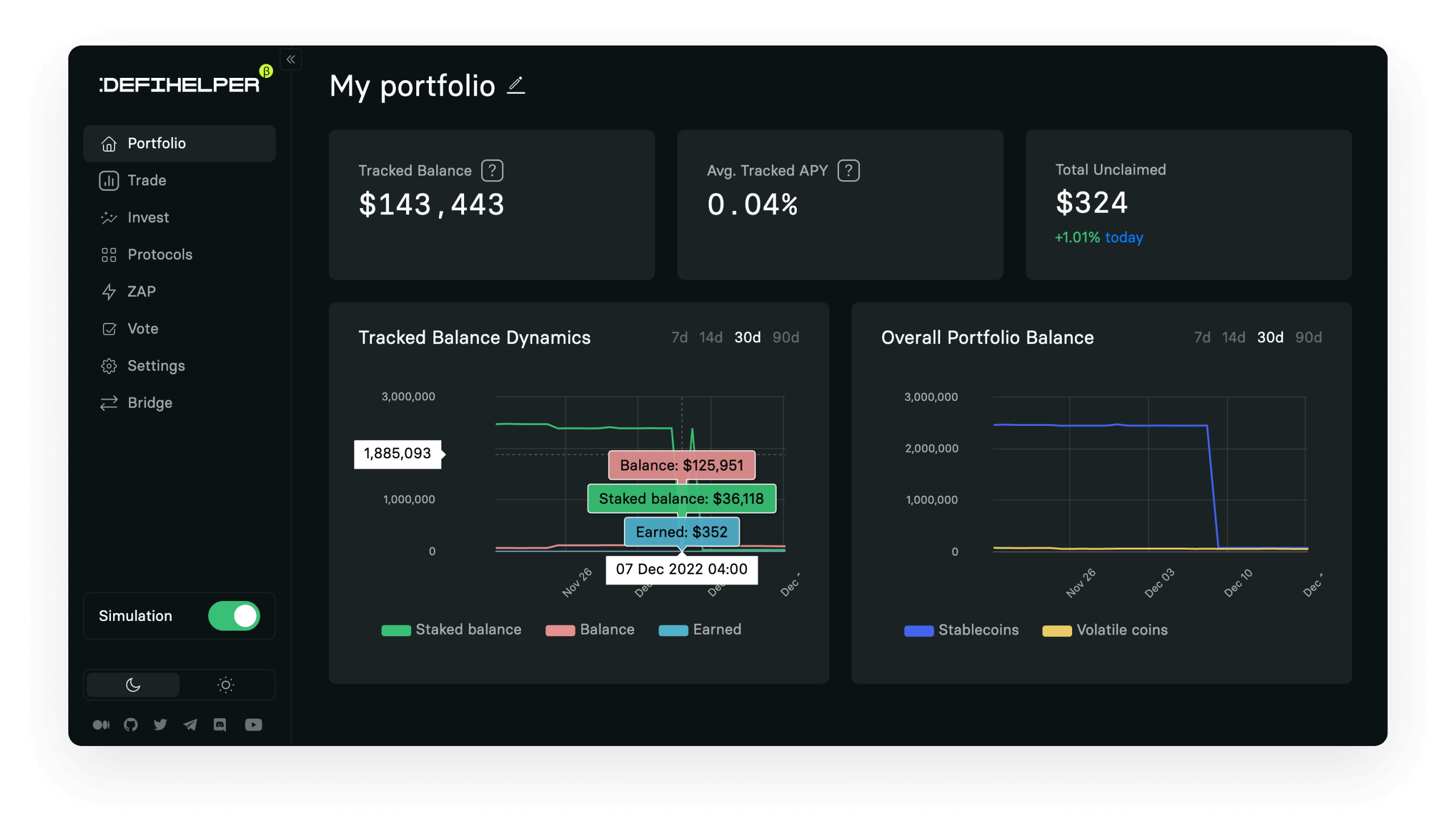
A clearer portfolio overview reduced the need to jump between fragments of the system and made important signals easier to read in one place.
Automation discovery and action states
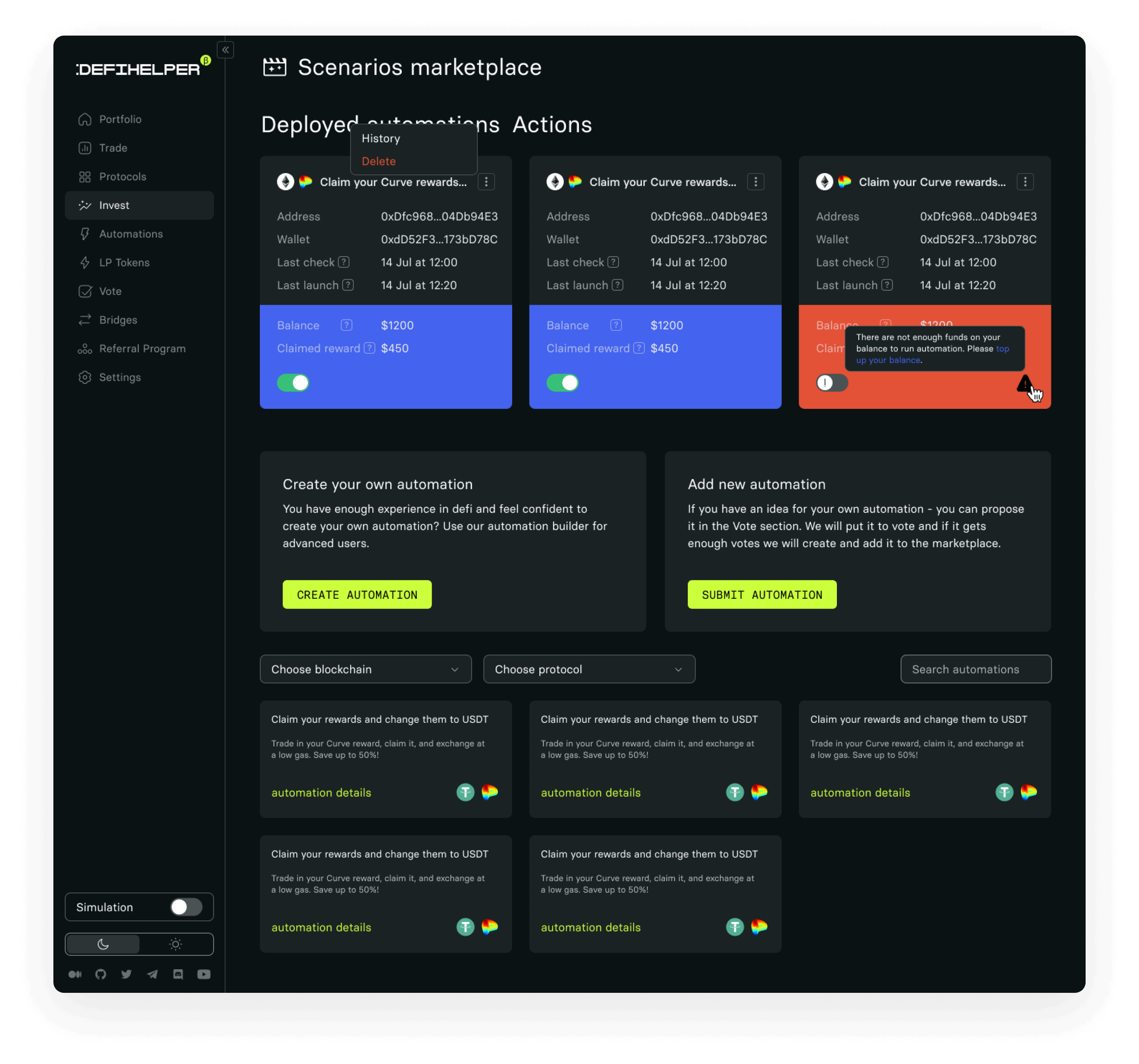
This view supports the story about discoverability, scenario clarity, and the way automation states had to feel trustworthy before users committed to them.
Onboarding logic
Explain value
why this feature matters now
Reduce risk
clarify logic, assumptions, and expected outcome
Guide entry
make the first action feel safe and understandable
Maintain trust
keep visibility after activation
Role and scope
The product demanded clear communication, careful framing, and trust-building before advanced actions could feel usable.
My role
I worked as a Product Designer across interface design, prototyping, user interviews, and A/B testing. My role was not only to improve the visual layer, but also to make complex product scenarios easier to understand and easier to adopt.
What I focused on
Value communication, product clarity, onboarding, decision support, and the first moments where users either trusted the product or dropped away from it.
Key constraints
The product operated in a complex domain where user mistakes could be costly. The interface had to explain advanced scenarios clearly, reduce hesitation, and support decision-making without overwhelming people with too much information at once.
Why this was difficult
The product needed to stay capable enough for advanced use cases while becoming more understandable for people who were not ready to reason like experienced traders.
Results and what
this case demonstrates.
The outcome was not just better UI, but better access to a complex system: clearer value communication, lower cognitive load, and stronger adoption of advanced functionality.
After restructuring the landing page around clearer hierarchy and value communication, conversion to app launch increased by 19%.
After user interviews and onboarding redesign for a weakly adopted feature, returning users increased by 24%.
The result was a product that asked less interpretation from users before asking them to act.
In products like this, clarity is not a visual polish layer. It is a prerequisite for adoption, confidence, and better decision-making.


